2.22.2008

Variety


As I've been taking on more projects, the question as to what I will and what I won't do has presented itself more seriously. As much as I appreciate variety, and it is true that variety is the spice of life, sometimes you need to reel it in and focus. There are so many things about bikes you begin to appreciate once you start making them, and so many things you feel you need to try, but in framebuilding as in many other things, repetition is key. I'm making a point of limiting my scope as a builder in these formative years of mine, and mastering those things first which are essential, and then taking on only those challenges I feel are worthy of repetition. Slowly, the list is growing.

Making my own seatstay caps is on the list.

2.05.2008

A step in the right direction.

It's taken a while, but I'm finally getting to the point where I'm refining some of the frame graphics I've been working with. This is a big step in the right direction in terms of professionalism, but I've put it on the back burner until recently mainly because it has nothing to do with building a good frame. Still, I realize its importance and so far I really like the results. The track bike I built last month will be the first bike to get the new headbadge and new downtube graphics.

Here's the headbadge:

These are made of stainless steel and some will have a mirror polish and others a more matte brushed finish, depending on what the customer thinks best suits the frame. The picture shows how I receive the badges from the laser-cutter. I am also having 'MAP' laser-engraved below the fleur de lis which should give the badges a finished look.


The other improvement is in the downtube logo.
Here it is without color, and as it's meant to wrap around a tube, its twin image is above it.


What I like about it most is its versatility in the ways it can be utilized. The inside of the globe can be one color and the text another contrasting color. Or for a more subtle look, the color of the frame can show through the lines of the globe while only the text is a contrasting color.

Can't wait to see some variations.

2.03.2008

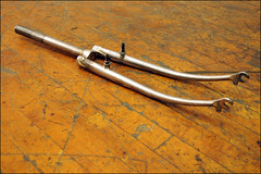
Not the spoon, but the fork.


Not the spoon, but the fork.
Originally uploaded by mapcycles
I'm really enjoying building this frame. There are going to be some really classy details in the build, so I'm taking the opportunity to really make this a special bike. It's going to be a city bike with fenders, front platform rack and integrated lighting. So far, I've carved the lugs, mitered the tubeset and today I finished the fork.